


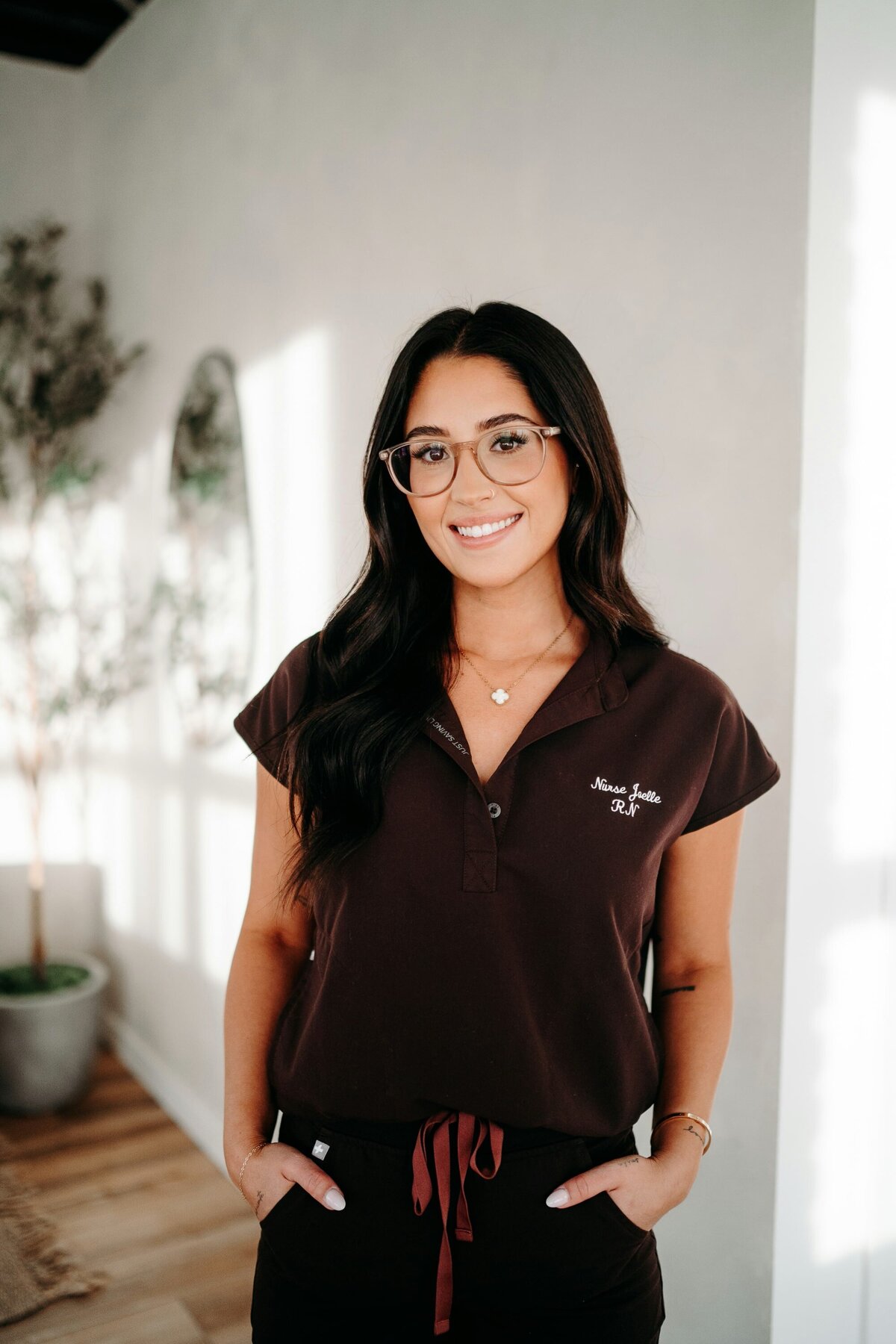

When Nurse Joelle first reached out, she already had something many business owners spend years building: experience, confidence in her craft, and a loyal following. As a Edmonton nurse injector, she had been practicing for years and had grown a strong presence on social media, where people trusted her voice, her results, and her approach.
What she didn’t have was a professional home base.
There was no website she felt confident sending people to, whether that was potential clients, peers, or connections she met through networking. Everything lived on social platforms, which worked to a point, but didn’t reflect the level of professionalism and credibility she had built offline. She knew it was time for something more grounded and intentional.
From our very first conversation, I felt excited about this project because it aligned so clearly with how I think about branding. This wasn’t about doing more… it was about refinement. Bringing together her experience, her calm presence, and a clear online home through thoughtful brand and Showit website design for a nurse injector felt like exactly the kind of work I love doing.
Why Simplicity Sells in Aesthetic Medicine Branding
Aesthetic medicine is one of those industries where branding can easily tip into extremes: overly clinical on one end… or flashy and intimidating on the other. Neither felt right for Joelle. What mattered more was creating something that felt calm, considered, and genuinely human.
Minimal branding isn’t boring; it’s intentional. It creates space for trust, which is especially important in an industry where clients are literally putting their face in someone else’s hands. People aren’t just looking for results — they want to feel at ease, informed, and confident in the person they’re choosing.
That understanding shaped every decision we made.
Joelle herself is relaxed, approachable, and grounded. She talks to you like a friend, not an authority figure trying to impress. Her business brand needed to carry that same energy as her: effortless and clean, quietly confident, and never cold or overly polished.


Designing a Brand That Feels Approachable, Not Clinical
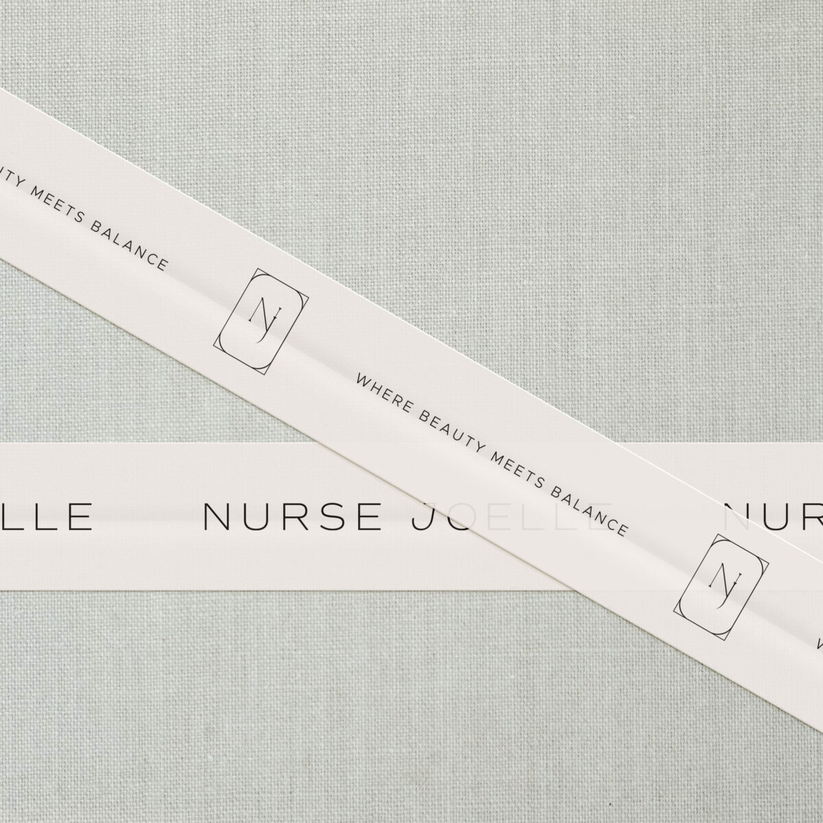
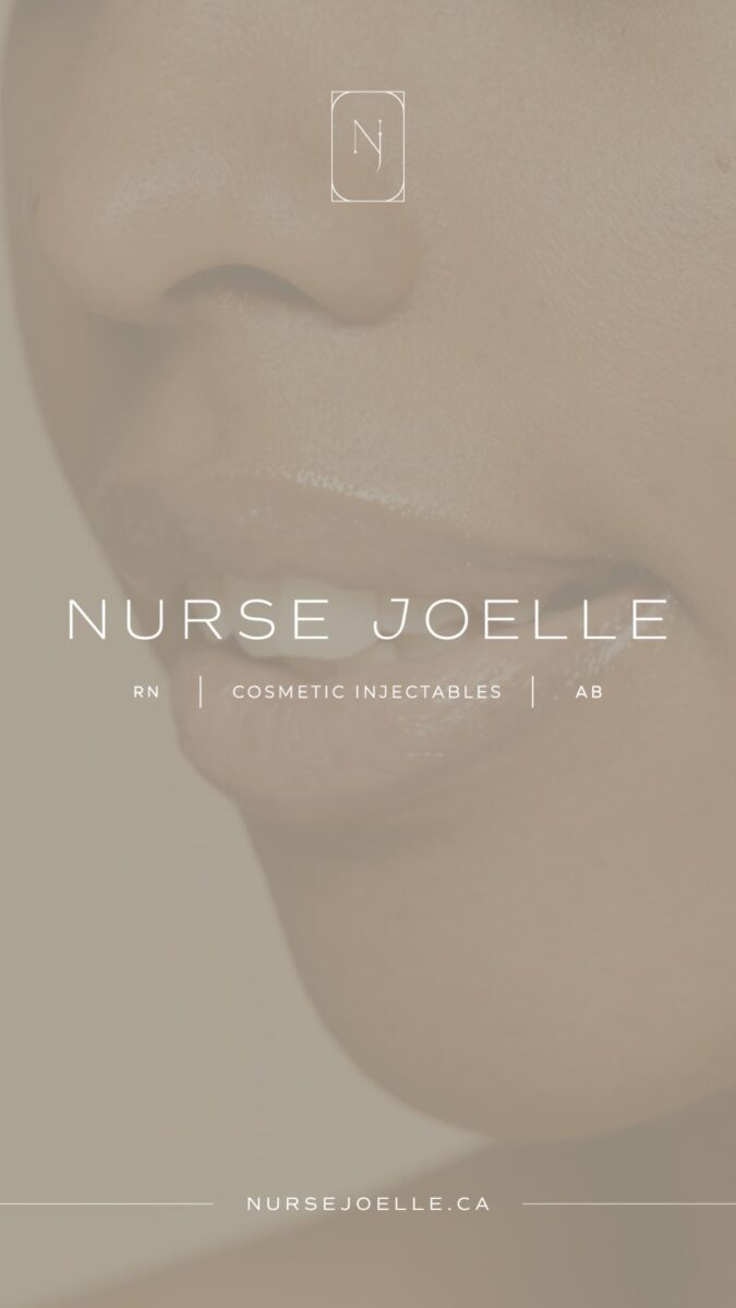
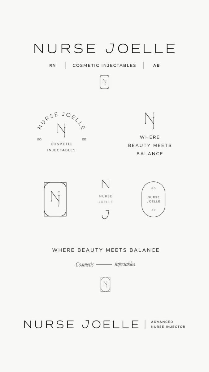
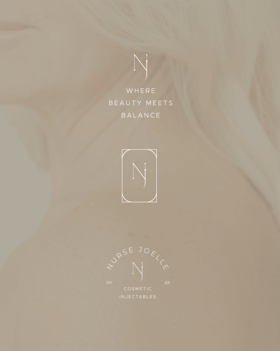
In an industry where many clinics lean into beauty-forward trends (didone serif fonts, high-contrast blacks and browns, and editorial styling) we intentionally took a different approach. We chose a geometric sans serif to convey modernity and ease, then layered in subtle details that add meaning without overpowering the design.
The slightly tilted “J” reflects the natural process of aging, not as something static or in need of correction, but as something dynamic and constantly evolving. Aging, here, is treated as movement rather than something to fight against.
That philosophy carries through the monogram as well, subtly merging Joelle’s initials to echo the shape of a syringe. It mirrors her approach to treatments: understated, intentional enhancements that elevate what already exists rather than dramatic change.
Together, the brand feels clean, minimal, and human — just like Joelle herself.
Related Post: 7 Telltale Signs It Might Be Time For A Rebrand
Letting Personality Lead the Client Experience
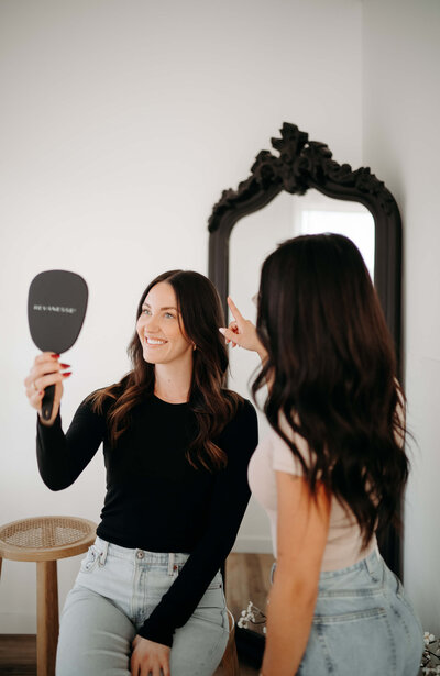
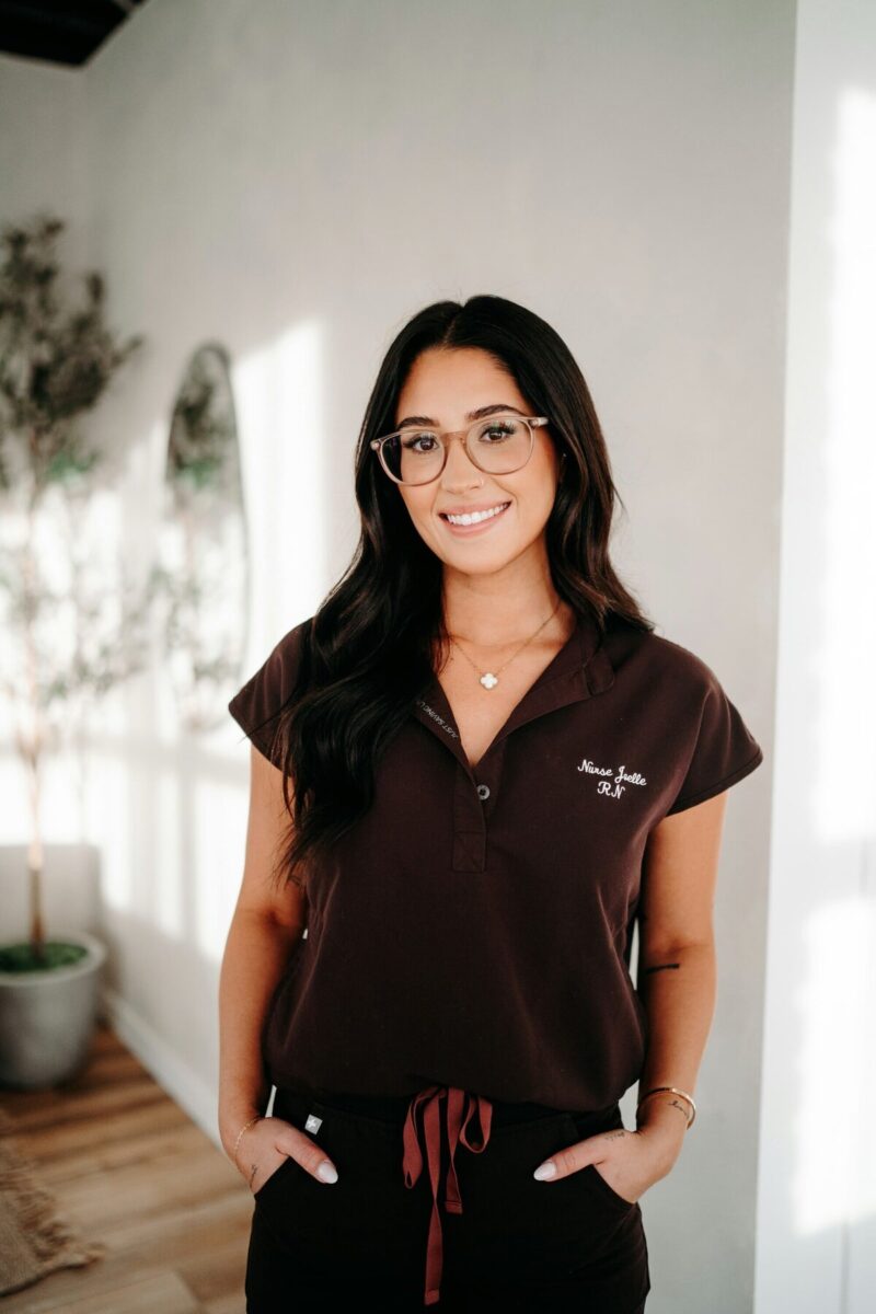
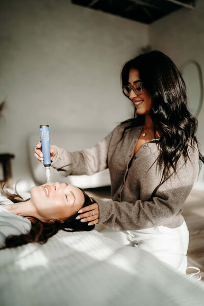
Brand photography played a big role in pulling everything together. Instead of stiff, overly polished headshots, we leaned into imagery that actually feels like Joelle: relaxed and approachable with jeans-and-t-shirt energy! The kind of presence that immediately puts you at ease.
This wasn’t about creating a polished persona or trying to look a certain way. It was about showing up honestly and letting her personality lead.
Her brand photos carry that “what you see is what you get” feeling throughout the brand. They reinforce a sense of ease and approachability, helping potential clients feel comfortable and confident long before they ever book an appointment.
Related Post: 6 Ways To Infuse Personality Into Your Brand To Book More Clients
A Strategic Website That Met Her Where She Was
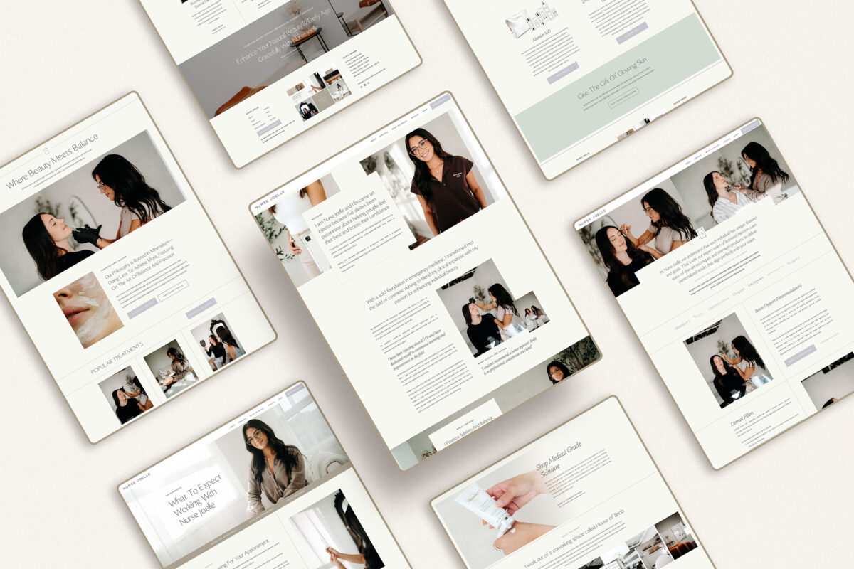
For where Nurse Joelle was at in her business, a fully custom website wasn’t necessary. What she needed was something efficient, elevated, and easy to maintain: a professional online home that matched her experience without adding complexity to her business.
We used my Beaute Showit website template as the foundation, then customized it to feel entirely her. This allowed us to move quickly while still creating a polished, professional presence that aligned with her brand. Instead of starting from scratch, we focused on what mattered most: clarity, simplicity, and ease.
This kind of Showit website design for nurse injectors keeps things streamlined and stress-free, offering flexibility and a polished look without overcomplicating anything. Showit made it easy for Joelle to update her site herself so her website supports her day-to-day work instead of becoming another thing on her to-do list.
Most importantly, the website finally gave her a real home base. No matter how someone found her, she now has a space she feels confident sharing, one that feels professional, credible, and effortless all at once.
When Simplicity Starts to Work For You
This is one of the more exciting results I’m so thrilled to share. Within six months of launching her new brand and website, Joelle began ranking for highly competitive local keywords, including “Edmonton nurse injector” on the first page and “Botox & Fillers Edmonton” climbing onto the second page.
The results were such a good reminder that clarity and simplicity don’t just feel good — they actually work. When your brand and website truly align with who you are and how you serve your clients, visibility and trust have a way of following naturally (and that’s always worth celebrating)!
A Thoughtful, Intentional Approach to Aesthetic Medicine Branding
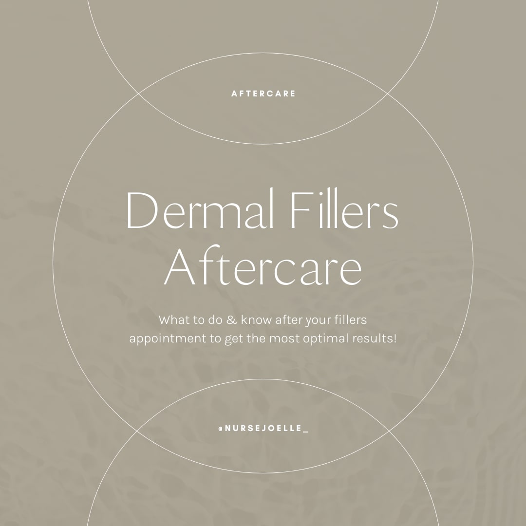
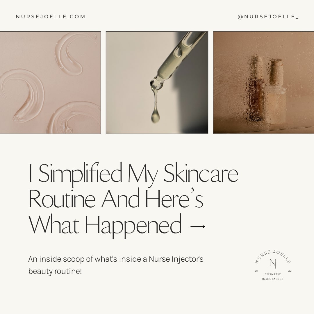
For Joelle, minimal branding wasn’t a trend. It was a strategy. Through strategic brand and Showit website design for a nurse injector, we created space for trust, professionalism, and ease, while giving her a clear, confident place to send people as her business continues to grow. Sometimes, the most effective thing you can do is simplify!
If you’re a nurse injector who’s built experience and credibility but feels like your online presence hasn’t caught up yet, this is your reminder that your brand doesn’t need to be loud to be effective. It needs to feel aligned.
And if you’ve been considering a more intentional, streamlined brand and website, I’d love to connect and help you build a personality-infused brand that attracts clients with ease!
★★★★★
“Working with Jess has been an absolute game-changer for my business! From the moment we began the project, she took the time to truly understand my vision, target audience, and brand values. The result was a cohesive and striking brand identity that perfectly reflects the essence of my business. The logo, color palette, and typography are not only visually appealing but also strategically designed to connect with my clients on a deeper level.
When it came to the website, Jess exceeded all expectations. She created a user-friendly, beautifully designed site that is both easy to navigate and optimized for conversions. The process was smooth, and her communication was excellent throughout, ensuring that I was involved every step of the way. Since launching, I’ve noticed an increase in both website traffic and client inquiries, and I’ve received numerous compliments on the sleek, professional design. I couldn’t be happier with the results, and I highly recommend Jess to anyone looking for a talented, thoughtful, and results-driven web/branding designer.”
— Nurse Joelle, Nurse Injector


FREE One-Page Showit Website Template
Take Showit For A Spin
Bringing your designer into your photoshoot ensures every image is intentionally aligned with your website, messaging, and designed to convert, not just look beautiful!

Why Work With A Website Designer When Planning A Brand Photoshoot
Finally, a design-forward AND user-friendly email marketing tool that makes sending emails fun again while bringing in actual conversions and results!

Why Flodesk Is The Best Email Marketing Platform For Small Business Owners
Read the post →
Readers' Favorites
read the post →


 connect with me on the gram!


© Vividly Made 2020-2026


