


There’s a certain kind of project that stays with you long after it’s finished. You’d think it was it was scroll-stopping or trend-forward… but instead, it was because it required you to slow down, listen deeply, and design with care. This was one of those projects which I’m so proud to share!
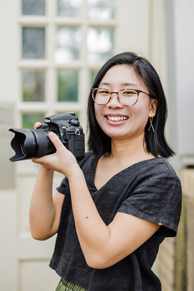
When Mei Lin (Mei Lin Barral Photography) came to me, she wasn’t looking for a complete reinvention. She loved parts of her existing brand. It had served her well for a long time. But she could feel quietly and persistently that she had outgrown it.
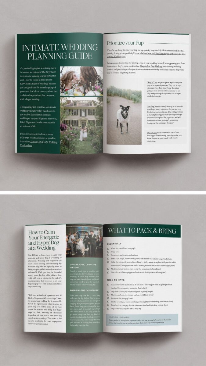
Her business was evolving. She was transitioning from photographing a wide range of wedding sizes to focusing on intimate, small, and meaningful celebrations. Weddings where the experience mattered more than spectacle. Where dogs and animals weren’t just allowed, but encouraged and celebrated. Where connection, presence, and being fully yourself mattered more than tradition or expectation.
What she wanted wasn’t louder branding. She wanted something more grounded. More refined. Something that felt calm, high-quality, and deeply welcoming: a brand that didn’t just represent her work, but reflected who she is and how she shows up for the people she photographs.
When success is defined by safety, not visibility
One of the first things Mei Lin shared in her intake was how intertwined her definition of success is with her values. Yes, she wants to be known for documenting beautiful weddings and love stories. But more than that, she wants to be known as a safe, kind, and affirming presence — someone couples can trust with one of the most personal days of their lives.
She shared a story about a small backyard wedding she photographed that year. It wasn’t a “portfolio” wedding in the traditional sense. No grand venue, no elaborate florals, no magazine-worthy details. The couple prioritized photography over almost everything else because what mattered most to them was being seen and remembered honestly.
That wedding may never be advertised or published, but it stayed with her. And in hearing that, it became a quiet anchor for this rebrand.
Outgrowing “playful” and stepping into something more intentional
Visually, Mei Lin described her previous brand as playful, bold, and casual. And while it still held meaning, it no longer reflected where she was headed. Her work had grown more nuanced, her clients were prioritizing intentional experiences over material details, and naturally, her pricing — and her sense of self — were evolving right along with it.
She wanted her brand to feel elevated, but not cold. Minimal, without feeling sterile. Refined, while still deeply human.
As someone who works in brand design for photographers, this is a transition I see often. It’s not about abandoning who you were: it’s about allowing your brand to grow alongside you.
And in this case, the challenge wasn’t to chase what was trending in the wedding industry. In fact, it was quite the opposite!
Old branding (left); new branding (right)
Choosing restraint in a sea of sameness
At the time, the market was saturated with two extremes: neutral, all-beige minimalism on one end, and loud, maximalist, hyper-colorful branding on the other. Inclusivity was often expressed through vague language (“love is love,” “all are welcome”) without much depth or specificity behind it.
We were clear early on that this brand wouldn’t rely on aesthetics alone to do the work. Nor would it use broad statements to signal values. Instead, we focused on designing something quieter, more intentional, and more specific: a brand that communicates safety and inclusivity through tone, pacing, symbolism, and care.
Sometimes, what you don’t say and how you say it matters more than what you put in bold headlines.
Designing from values outward
Every decision in this brand started from the inside and moved outward.
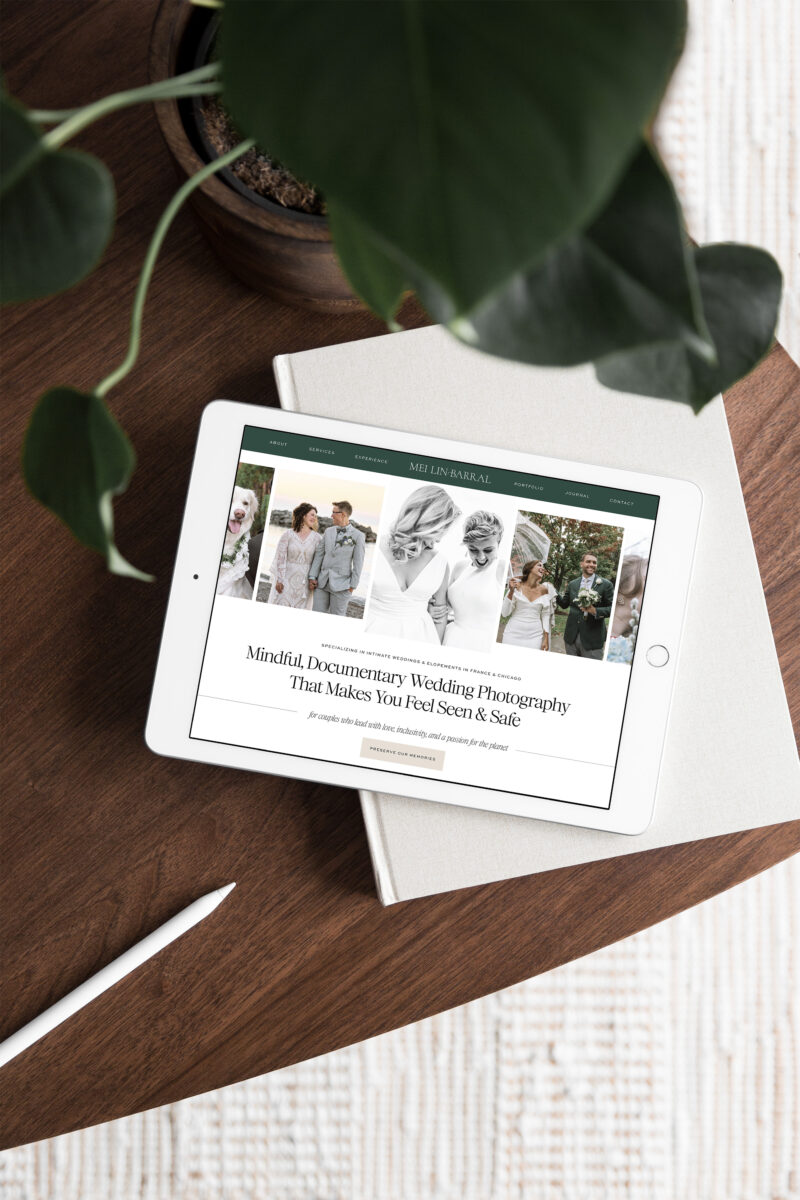
We began by grounding the brand in Mei Lin’s purpose: creating affirming, mindful photography experiences that allow couples to be fully themselves. From there, we explored how that could show up visually in a way that felt natural, not performative.
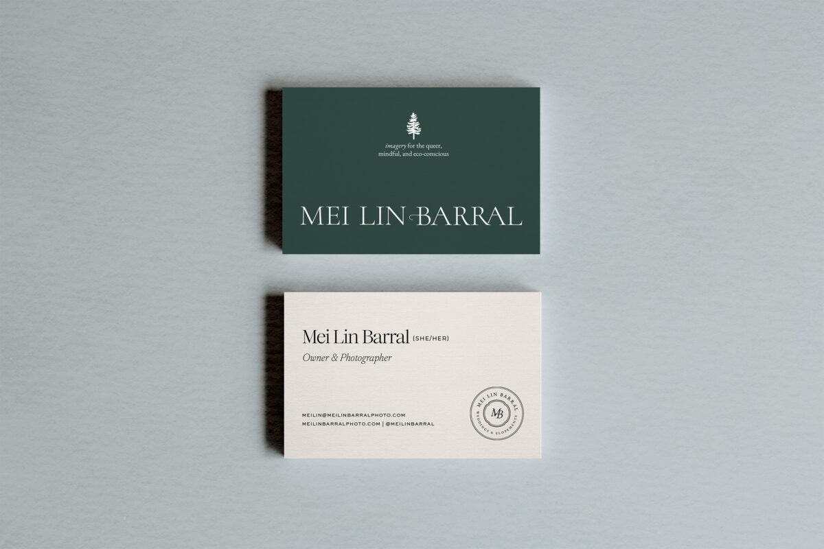
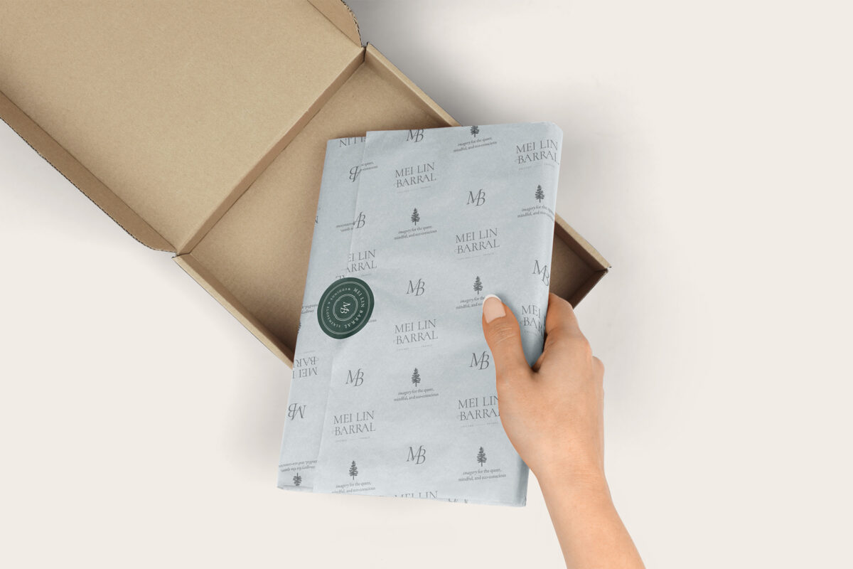
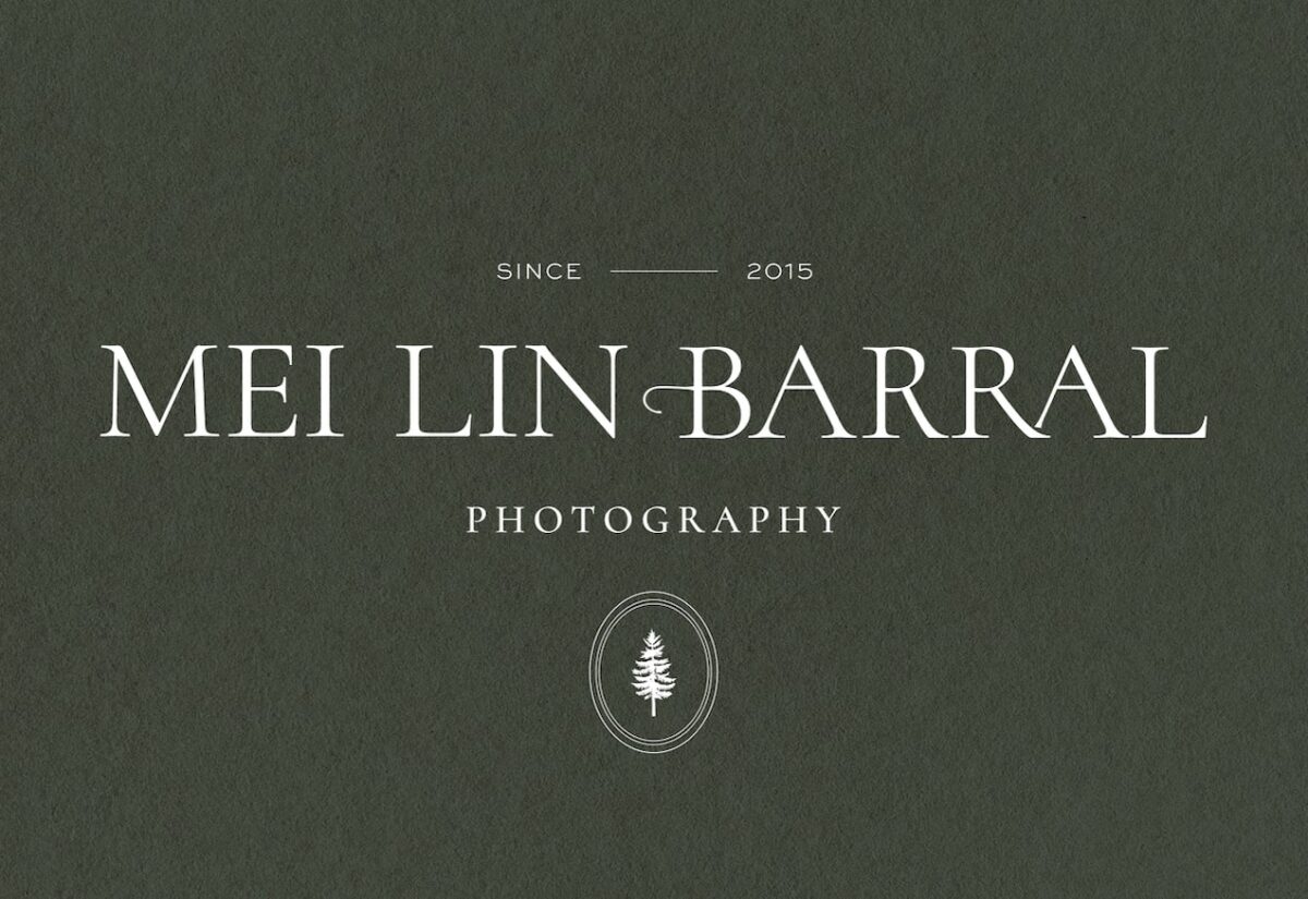
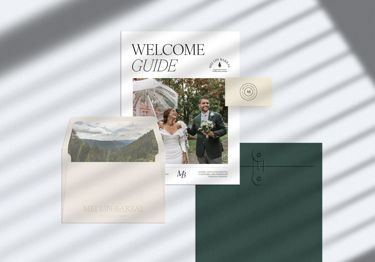
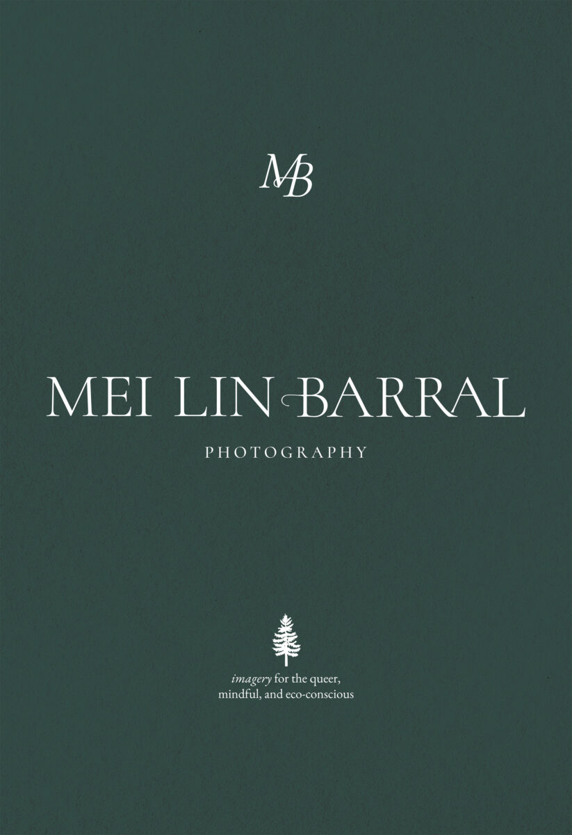
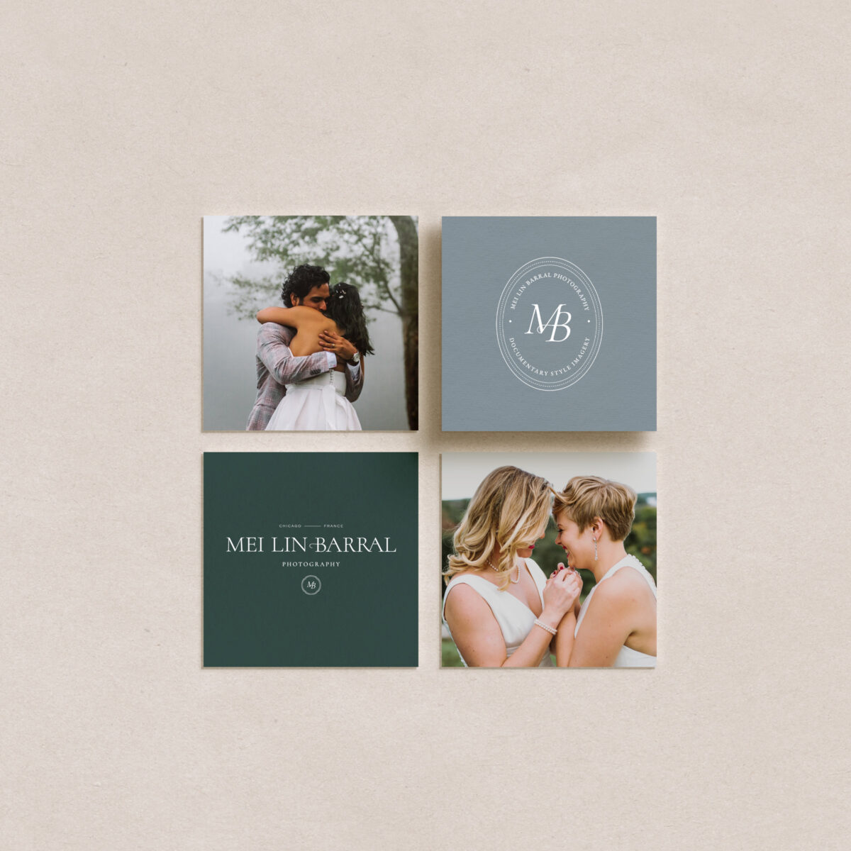
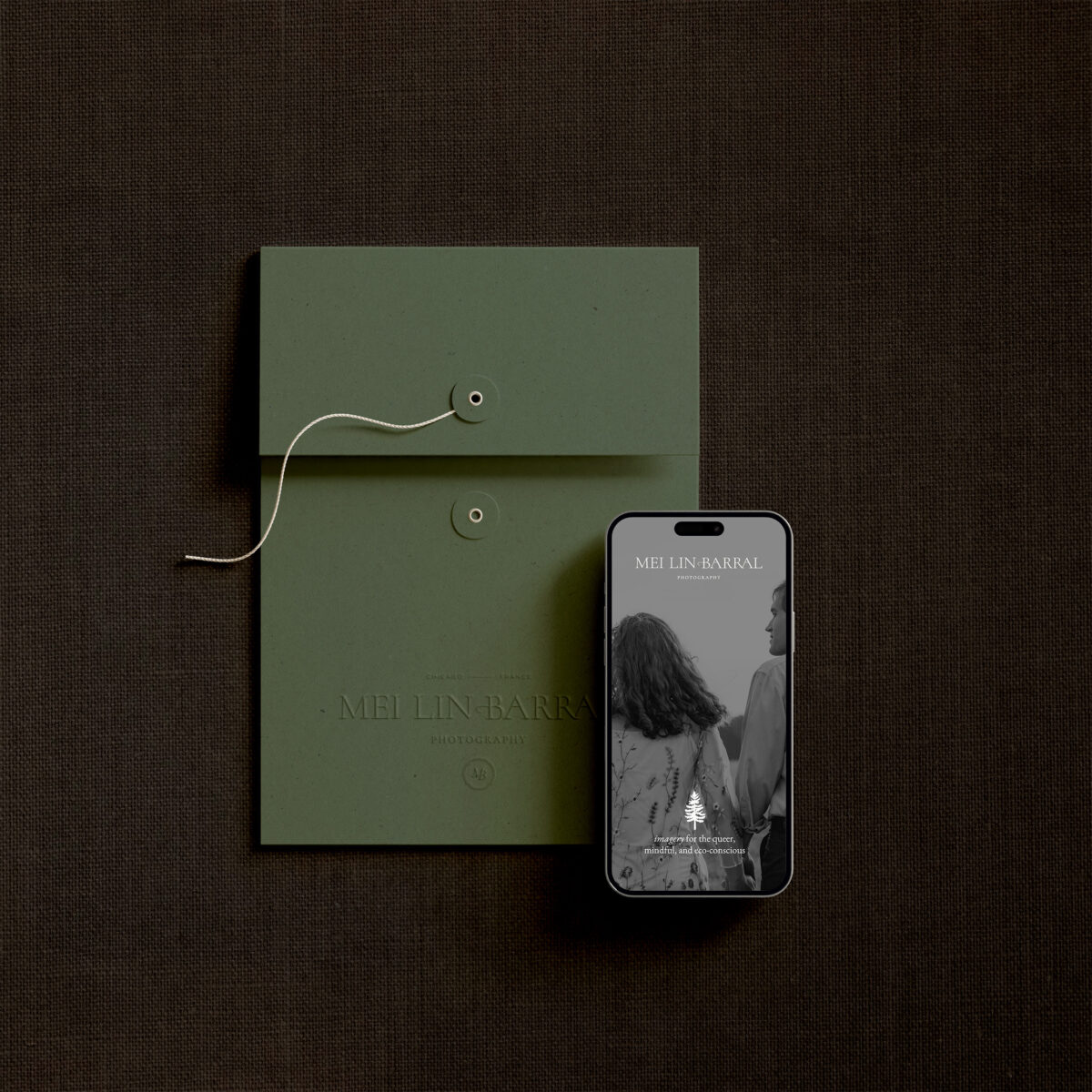
The identity leans into palettes of blues, greens, and warm neutrals: brand colors that evoke calm, nature, and steadiness. A traditional serif font anchors the brand with a sense of nostalgia and elegance, while custom letter connections introduce softness and flow. Nothing feels harsh or abrupt. Everything feels considered.
One of the most meaningful elements is the pine tree illustration used as a brand icon. Pine trees are resilient. They thrive in diverse climates. They provide shelter and a sense of quiet grounding. In getting to know Mei Lin as a business owner, human, and ally, I chose this as her brandmark as it is a subtle symbol of endurance, safety, and belonging — and of the kind of space she creates for her couples.
It’s not loud or innovative. But it’s powerful.
Letting the brand speak without shouting
What I’m most proud of in this project is the restraint. The branding doesn’t try to convince. It doesn’t over-explain. It allows the work and the values behind it to speak for themselves.
Mei Lin shared that when she saw the brand presentation, she felt an immediate sense of peace. She felt seen and understood in a way she didn’t realize was possible through branding. The design felt intuitive, refined, and natural: elevated without feeling forced.
That response matters to me more than any aesthetic trend ever could 🥺
Because when a brand feels right at that level, it changes how a business owner shows up. It removes friction, creates clarity, and allows confidence to settle in quietly, rather than needing to be announced.
Embodying the brand, not performing it
This rebrand gives Mei Lin permission to lead with who she is: not just as a photographer, but as a human. It supports her focus on intimate weddings, queer couples, dog parents, nature lovers, and people who value experiences over excess.
It also propels her growth into a higher investment range without losing warmth or accessibility. The brand doesn’t feel exclusive. It feels intentional.
To me, that’s the difference.
And it’s what thoughtful, strategic brand design for photographers can do when it’s rooted in values instead of trends.
Related Post: 5 Ways to Increase Wedding Bookings From Your Website As a Wedding Pro
A quiet reminder I’ll carry forward
This project reaffirmed something I believe deeply: when a brand is rooted in values, care, and intention, simplicity often says more than anything loud or performative ever could.
Not every brand needs to be bold. Not every message needs to be shouted. Sometimes, the most meaningful work happens in the quiet moments — when someone feels safe, seen, and held by the experience you’ve designed.
That’s what this brand does.
And that’s the kind of work I’ll always be proud to create.
If you’re a creative business owner who’s been quietly feeling the pull toward a soft pivot or rebrand, I’d love to connect and hear more about where you’re headed and how I can support you along the way!
★★★★★
“From the very first moment I opened the brand presentation, I was absolutely blown away. I felt instantly seen and understood — what Jess created felt right. It felt true to my core beliefs, values, and ethics in a way I didn’t even realize was possible through branding.
What I love most is the quiet sophistication of the design. It’s clearly thoughtful and intentional, yet it feels natural and intuitive — not forced or overdone. I can truly feel the polished, elevated quality of the work, and I believe that same sense of peace and sincerity will resonate deeply with my ideal clients.
This branding is even better than I could have imagined. The variations feel cohesive, calm, and confident, allowing the brand to speak for itself without needing to be bold or loud. I’m beyond grateful to have found Jess … this experience exceeded every expectation!”
— Mei Lin Barral, Wedding & Elopement Photographer


FREE One-Page Showit Website Template
Take Showit For A Spin
Bringing your designer into your photoshoot ensures every image is intentionally aligned with your website, messaging, and designed to convert, not just look beautiful!

Why Work With A Website Designer When Planning A Brand Photoshoot
Finally, a design-forward AND user-friendly email marketing tool that makes sending emails fun again while bringing in actual conversions and results!

Why Flodesk Is The Best Email Marketing Platform For Small Business Owners
Read the post →
Readers' Favorites
read the post →


 connect with me on the gram!


© Vividly Made 2020-2026
")


