


When I’m working with service-based businesses, one thing I see over and over again is how easily social media ends up taking priority. And I get it … It’s where the energy is! It’s more immediate, more interactive, and honestly, just more fun to show up in. There’s always something new happening: new ideas, new trends, new ways to connect, and it keeps you in that rhythm of creating.
Believe me, I’m guilty of it too and I’m a website designer!!
And I know it’s not that you don’t know your website is important… it just often sits a little lower on the day-to-day priority list. Most of your focus naturally goes to social media and marketing, so the website ends up getting updated in between everything else. I totally get that – and it’s something I see all the time in social media agency website design projects, where social presence becomes incredibly strong, but the website doesn’t always evolve at the same pace.
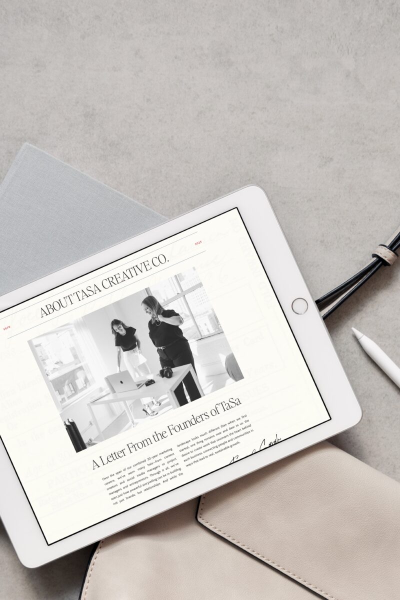
With TaSa Creative Co., this showed up in a really similar way. Their content felt intentional, their visuals were consistent, and they were clearly attracting the kind of clients they wanted to work with… but the website wasn’t quite reflecting that same clarity or confidence anymore.
Bringing Alignment Between Social Media and Website
For this social media agency website design, the goal wasn’t to reinvent anything about TaSa. Their brand already had a really strong foundation, and their social presence had done such a good job of clearly positioning who they are and the kind of clients they work with.
So the focus became alignment.
We wanted the website to feel like a natural extension of their social media presence: something that carried the same clarity, energy, and intention through every page. Not something separate or overly polished in a different direction, but something that felt cohesive with how they already show up online.
At the same time, the site still had to do its job as a business tool. It had to clearly communicate their services, support their sales process, and make it easier for potential clients to understand what they do without needing extra explanation on the side.
Once those priorities were clear, everything else in the design started to follow from there.
Creating a Cohesive Visual Direction
One of the first things we addressed was content, because even the strongest design can only go as far as what it has to work with visually!
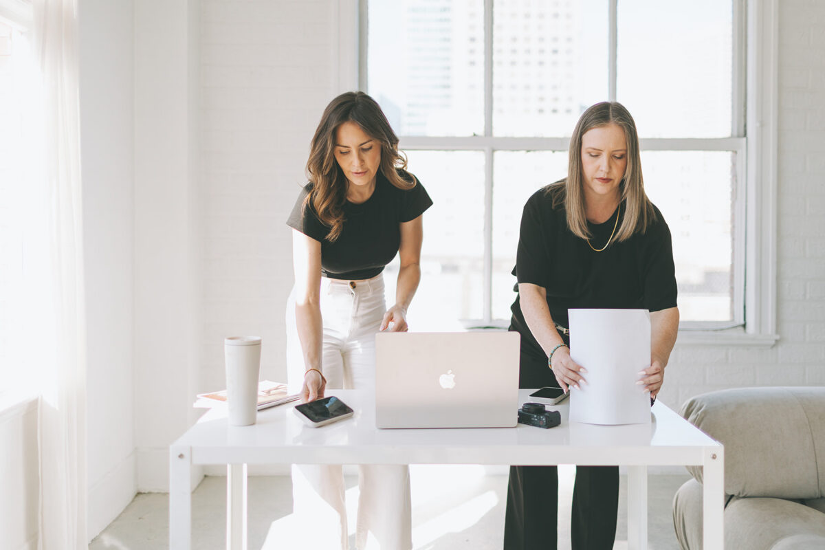
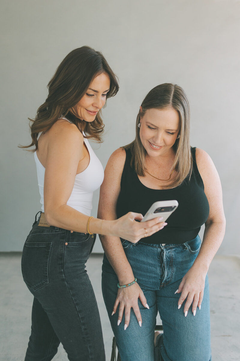
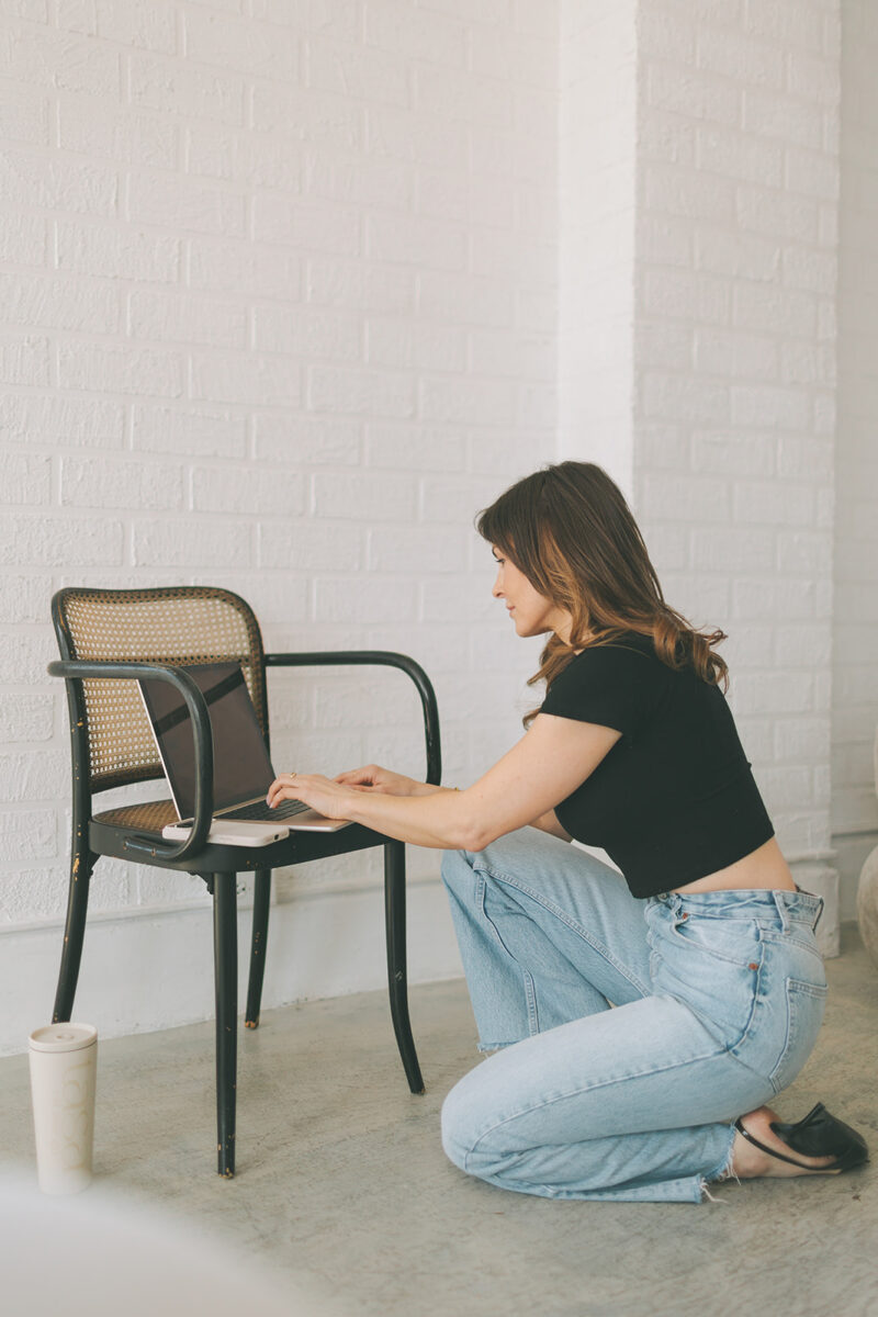
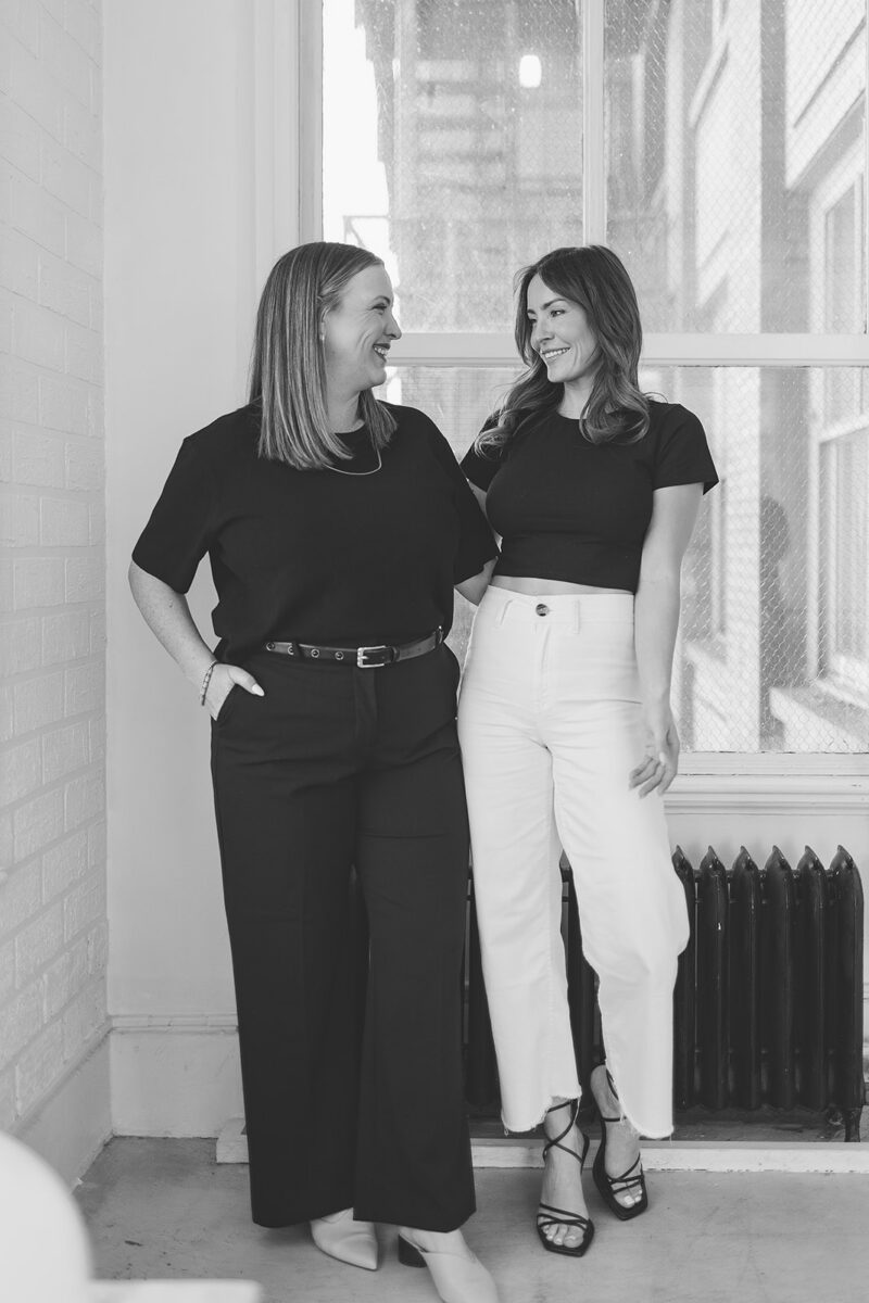
TaSa already had branding in place, along with their new website copy written by Danielle from Compel Communications. So the next step was focusing on imagery that actually matched their brand energy as agency co-founders.
We ended up planning a dedicated content shoot to support both the website and their wider brand ecosystem, where I helped guide the creative direction through a Pinterest board, shot list, and prop planning so everything felt intentional and easy to execute.
The purpose wasn’t just to “refresh brand photos,” but to also build a cohesive visual library Tania and Sarah could actually use. Across their website, social media, email marketing, and any other client-facing materials that come up as their brand grows.
Because that’s where consistency really starts to matter. Especially for a social-first business, where people are constantly moving between touchpoints and forming impressions in seconds. When everything feels aligned visually, the whole brand experience just lands differently.
Related Post: Why Work With A Website Designer When Planning Your Brand Photoshoot
Translating the Brand Into a Website Experience
Once the direction was clear, the design process became less about adding new things and more about refining what already existed in their brand and actually making it work cohesively across the website.
A big part of the thinking here was how someone would actually experience the site after coming from their social media. Their audience already knows their content style, their energy, the type of work they do… so the website needed to feel like a natural continuation of that experience, not a completely separate space they suddenly land in and have to reorient themselves in.
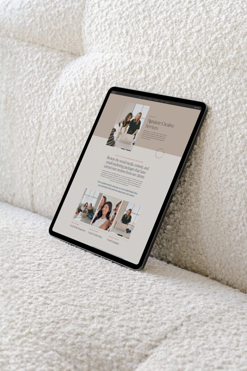
We leaned into a more editorial layout approach that gave space for both visuals and messaging to breathe. Instead of overcrowding sections or trying to fit too much information at once, the focus was on pacing: how someone moves through the site, how quickly they understand what TaSa does, and how naturally they’re guided toward inquiry.
Because their work is rooted in content creation, we also brought in more movement through video and dynamic visuals! Here, the goal wasn’t to overwhelm the experience or distract from the messaging, but to reflect the energy of their work in a way that supports clarity rather than competing with it.
A lot of this work came down to something much simpler than it sounds on paper: actually making sure their branding felt consistent once it was applied IRL! Because having brand guidelines is one thing… but seeing how they translate across spacing, hierarchy, layout, and how content actually flows from section to section is where things start to feel different.
Brand Alignment Beyond Social Media
I often tell clients that some of the results from a website project aren’t always measurable in the traditional sense. A lot of the time, the biggest shift is something more intangible (and internal): confidence.
It’s the way a brand feels when everything starts to align properly across touchpoints, especially between social media and their website.
For Tania and Sarah, that shift showed up quickly! Their website no longer felt like something separate or disconnected from their social presence. Instead, it became a natural extension of it: visually consistent, easier to navigate, and much more aligned with the level they were already operating at.
And when that kind of alignment happens, it changes how you move through your business. You’re no longer second-guessing what to send people, or feeling the need to over-explain on sales calls, or relying on social media alone to do all the heavy lifting.
Instead, everything starts to work together as a funnel… much like a car where all the parts are connected and moving in sync!
Related Post: How To Build A Cohesive Brand Experience
What Matters in Social Media Agency Website Design
If there’s one thing I always come back to in social media agency website design, it’s that your website and social media need to work as one system. You’re already doing the work of teaching your clients about consistency, conversion, and cohesive brand touch-points. So your own website should reflect that same standard.
You can have the strongest social presence, the best content strategy, and a really active marketing engine… but if the website doesn’t carry that same clarity, there’s often a disconnect somewhere in the buying journey. And especially if you’re running ads or driving paid traffic to your site, that gap can directly affect conversions. IYKYK!
So here are a few things I suggest for social media agency building their own websites:
1. Visual consistency is doing more work than you think
Your branding and visual identity are not the same thing as your social media content. Social is where you adapt, experiment, and show up in different ways… but branding is what holds everything together.
This is why a properly built brand system matters so much. It becomes the foundation for everything else, such as: your website, your social media, your email marketing, your client experience. Branding comes first, and everything else builds on top of it.
2. Design for mobile first, not as an afterthought
For most social media agencies, your audience is coming directly from Instagram, TikTok, or other social platforms, which means they’re landing on your website from their phone first.
So mobile isn’t just a version of your website… it’s the first impression. (and honestly, the one that matters most)
Making sure your mobile experience is intentional, easy to navigate, and strategically structured is key here. Platforms like Showit are great for this because they give you full control over how your mobile site actually feels, not just how it shrinks down from desktop.
3. Let your website show your work in context, not just snapshots
Screenshots and analytics can be powerful, but only when they’re used with intention. The goal isn’t to overload your site with proof, but to also tell the story behind the work.
So instead of just dropping screenshots into a portfolio, I always think about how the work is being framed.
- What was the challenge?
- What did you create?
- What changed as a result?
Pulling in different layers (graphics, content, video, campaign visuals) helps turn your portfolio into something that actually guides someone through your process, not just a collection of isolated pieces.

Bringing It All Back Into Alignment
That’s really what this project with TaSa Creative came down to: creating a website that could finally move in step with the momentum they had already built through social media. A marketing asset that didn’t feel disconnected from their brand, but actually worked alongside it.
When your website and social media are working together, everything starts to feel more cohesive. The messaging is clearer, the experience feels more intentional, and there’s less friction in how people move from discovering you to actually reaching out.
And for me, that’s always the goal 🙂 not just creating a website that looks good on its own, but building something that actually supports the way your brand shows up everywhere else!
If you’re in that in-between stage of knowing your website isn’t quite matching your social presence yet, I’d love for you to explore more of my work or reach out when you’re ready to bring everything into alignment!!


FREE One-Page Showit Website Template
Take Showit For A Spin
Bringing your designer into your photoshoot ensures every image is intentionally aligned with your website, messaging, and designed to convert, not just look beautiful!

Why Work With A Website Designer When Planning A Brand Photoshoot
Finally, a design-forward AND user-friendly email marketing tool that makes sending emails fun again while bringing in actual conversions and results!

Why Flodesk Is The Best Email Marketing Platform For Small Business Owners
Read the post →
Readers' Favorites
read the post →


 connect with me on the gram!


© Vividly Made 2020-2026
")


