


In today’s post, we will go over five mistakes to avoid on your website home page so that you can convert your audience into clients more effortlessly!
Nine times out of ten, your website home page is the first place a potential client will visit when they arrive on your website and the reality is, they also most likely have 12 different tabs open on their browser when they are looking for a service provider. I mean, come on, you are probably very much guilty of that too! So not only are competing for their attention… but you are also now competing against 11 other open tabs.
Not to mention… studies have shown that it takes only 3-8 seconds to capture someone’s attention before they move on to something else (or worst, exit your website!)
That’s it… 3-8 seconds! I can’t even warm up a slice of pizza in the microwave… let alone melt cheese on toast…
So, to avoid being forgotten or abandoned, let’s ensure your website home page is optimized for higher engagement and conversion to attract your ideal client.
Here are five costly mistakes to avoid making on your website:
Not Having a Clear Website Goal (and Trying to Fit Everything on the Home Page)
One of the most common homepage mistakes I see has nothing to do with fonts, colors, or layout… it’s a lack of clarity around the goal of the website.
Before thinking about sections, links, or layout, you need to get clear on one thing: what is the goal of your website? If you don’t define that first, your homepage will almost always try to do too much.
As a website designer, I often see this happen in two very different ways. Some homepages are so long and packed with information that you don’t know where to look or what actually matters… while some others include nothing more than a short intro or mission statement.
Neither approach is doing you any favors. Your homepage doesn’t need to hold everything you’ve ever created, but it also shouldn’t leave people feeling stuck or unsure of what to do next. The sweet spot lives somewhere in the middle with clear, intentional sections that build trust and gently guide people deeper into your site.
The best way I can describe a homepage is like an airport terminal. Its job is to guide people where they need to go — clearly, intentionally, and without friction. Because a good airport terminal doesn’t send you everywhere at once. It points you toward the right gate.
A high-converting homepage isn’t about showcasing everything you do. It’s about guiding visitors toward the next best step, based on your primary and secondary website goals.
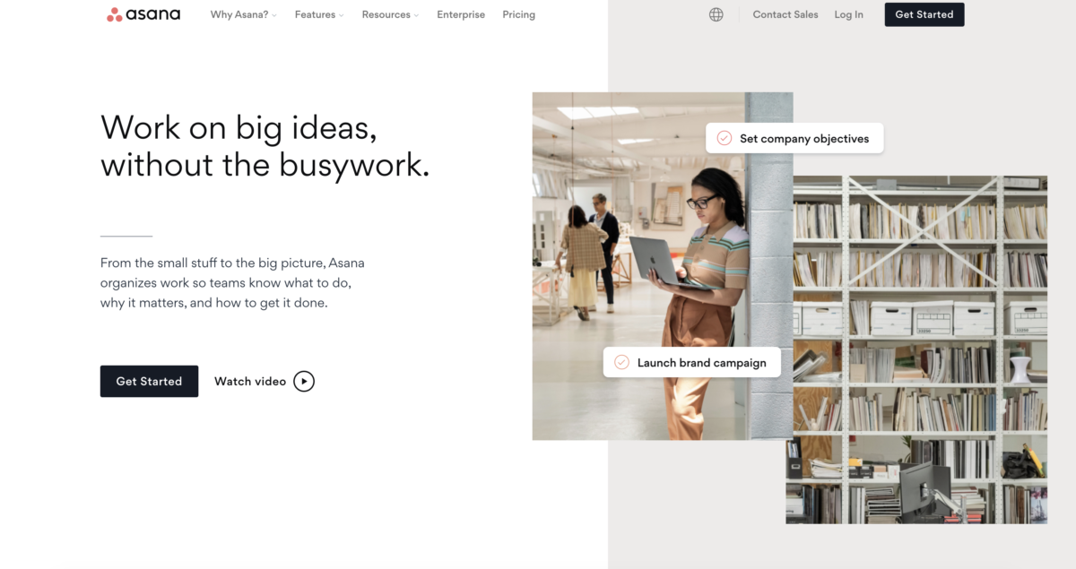
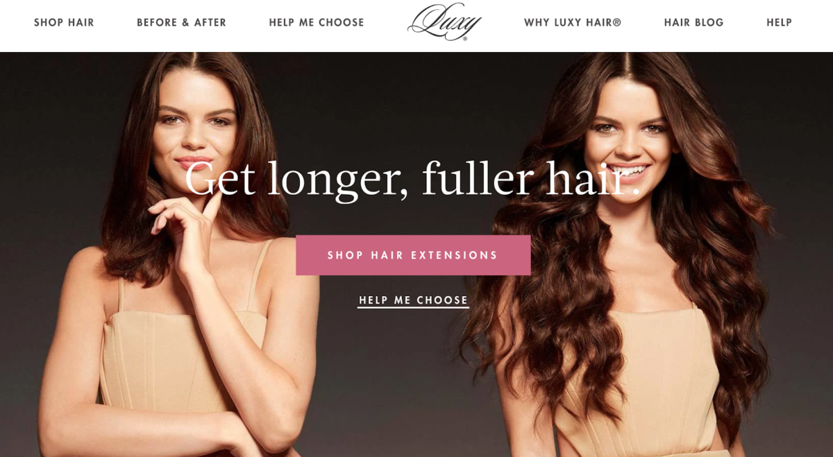
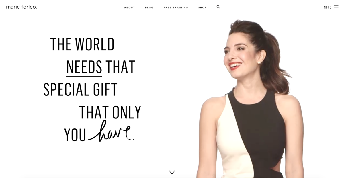
Vague Headline on Hero Banner
Okay, let me back up for a second. What exactly is a hero banner and where is that on your website? A hero banner is that wide section at the top of each website. It’s usually the first thing a visitor will see when they come across your website home page. Usually, if done right, it catches your attention instantly and moves you to action.
Pretty much, it’s a direct conversion tool.
Meaning… that’s prime real estate on your website. A GOLD MINE! And it’s a shame because there are businesses not using that section properly! And if we are talking about attention span, it can make or break your website.
While it is nice to have a welcome message, your business mission, or maybe your business tagline on there… it’s 100 x more strategic when you are using that space to speak to your visitor’s desires or pain points. What is it that they want and how are you positioned to help them? Remember what I said above… you have exactly 3-8 seconds to convince a visitor that they are in the right place and should continue scrolling to learn more. So… why are you trying to beat around the bush with a nice welcome message?
Here are some examples of businesses using the hero banner creatively and strategically:
Speaking to Everyone
There are two questions that are burning in your visitors’ brains when they land on your website home page: “who are you” and “are you for me”.
I have said it before and I will say it again… your ideal client should be your first and utmost priority when you are writing anything copy-related. So, of course, that means your website too!
The purpose of your website is ultimately FOR your ideal client. It’s not a place for you to dump your entire resumé on there or only to talk about YOU. While they do want to get to know who you are, they are more interested in learning about how your service will solve the challenges they are going through. Therefore, it is important to ensure your website copy is speaking to them directly no matter what.
Take Apple for example: They know their ideal client so well that they have mastered their messaging and language – from a 13-year-old to a 60-year-old. They aren’t trying to please and convince everyone to buy their computers or devices – they really wouldn’t care less. What they care about is solving a problem for their target audience… you know, the ones that value simplicity and ease of use.
In doing so, they have created custom “ideal client avatars” to really get to know each of their users down to the core. Simplicity is what their customer desires, therefore, it is reflected in everything that they do – marketing, product, design, and more. They avoid industry (and technical) jargon in their marketing and use simple words to describe HOW their product will make their life better. Rather than listing specs, they inject real-life examples as to where their product will fit in your life. The iPhone isn’t JUST a smartphone… it holds the power of an Apple computer right in their pocket.
You see what I mean?
Related Post: 5 Ways To Add Movement To Your Website
Poor Image Quality and Relevance
First impressions matter. At the end of the day, you and I are visual beings and we judge a book by its cover more often than we would like. Our brains are driven to take action visually, so when we come across imagery that is poor quality, blurry, or pixelated, we are instantly turned off. Even if your website has the best copy written in the world, imagery can make a visitor doubt your expertise.
I often say a high-converting website is made out of three things: design, messaging, and imagery. That is the trifecta. When implemented strategically and beautifully, it will turn heads like no other. It’s an investment that will always have a high ROI for your business.
At the end of the day, running a business requires a high level of professionalism. Investing in branding photography will help elevate your brand and communicate to your visitors effectively and emotionally. If you are interested in learning more, I have created a step-by-step guide to help plan and coordinate a successful brand photoshoot for your business for you to download!
And if your budget is tight, at the very least, invest in a stock photography membership! Here is a list of my favourite stock photography websites:
Paid (and worth every penny):
Unpaid:
*affiliate link
No Clear Call-To-Action
Last but not least, every website needs to have call-to-actions strategically placed on the home page to guide your visitor to the next step. Tell them what action they should take next if they want to find out more information. Don’t leave them hanging or questioning what to do next. Otherwise, all of that important work we have done above has now gone to waste!
Take your visitor on a journey through your website. Yes, that magic carpet journey experience I am talking about. Anticipate their needs, inform them with just enough information, and guide them through the transformation!
One of the main reasons visitors leave a website at first glance is because there are way too many choices to make. Sounds odd right? But actually, decision fatigue is a real psychological phenomenon that we experience on daily! Our brains crave simplicity. It doesn’t do well with cluttered information or one too many choices. How many times have you toggled between two or three choices … and instead of picking one, you decided to just walk away instead?
There’s a lot that goes on in creating a high-converting, strategic, and impactful website and it starts all right on the home page. A website is no longer a “nice to have” for any business, it is absolutely crucial and when designed properly, can be one of your most powerful marketing tools.
Working with a professional can save you time, money, and energy in the long run. if you are interested in creating a magnetic, high-converting website that works while you are sleeping, let’s chat!
LIKE THIS POST? SHARE & PIN IT!


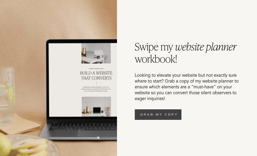
FREE One-Page Showit Website Template
Take Showit For A Spin
Bringing your designer into your photoshoot ensures every image is intentionally aligned with your website, messaging, and designed to convert, not just look beautiful!

Why Work With A Website Designer When Planning A Brand Photoshoot
Finally, a design-forward AND user-friendly email marketing tool that makes sending emails fun again while bringing in actual conversions and results!

Why Flodesk Is The Best Email Marketing Platform For Small Business Owners
Read the post →
Readers' Favorites
read the post →


 connect with me on the gram!


© Vividly Made 2020-2026
")


