


In this post, I will go over six creative yet subtle ways to add movement to your website to boost conversion, entice interest, and offer a memorable experience. No coding is required, especially if you choose to work with Showit!
Finding ways to delight your visitors as they land on your website is a fantastic way to enhance the user experience and help you stand out from the crowd. Statistics say it only takes “about 50 milliseconds (that’s 0.05 seconds) for users to form an opinion about your website that determines whether they like your site or not, whether they’ll stay or leave”. (Sweor, 2022). How insane is that?!
To add movement and motion to your website should be done delicately. Moderation is key when it comes to special effects. You don’t want to overwhelm the user by using too many in case it creates frustration… or worse, accessibility problems. Integrating them tastefully and subtly would be crucial to good design.
Without further ado, here are 6 simple ways to add movement to your website to boost conversion:
Text Animations
Similar to colour psychology in design, typography can evoke feelings and emotions when used properly. Text animations can give your website a unique design and add movement to your website in an engaging way.
Examples of easy-to-implement text animation/transitions:
- Text + Image Reveal (Timed)
- Text Transitions (Fade in, Slide Up/Down, Zoom In)
- Text Shadows
- Text Highlight
- FAQ Accordions
If you want to take it one step further, there are some pretty cool effects that you could look into using CSS, Javascript, or HTML, such as the typewriter effect, bouncing text, or even moving letters. The possibilities are endless when it comes to text animations! A great resource would be W3 Schools or Justin Aguilar’s CSS Animation Cheatsheet.
Video
A no-brainer! Uploading a video to your website can create a cinematic experience for your visitors by drawing their attention effortlessly, which in turn, increases your session duration analytics.
Website hosting platforms, such as Squarespace or Showit, now allow users to upload background videos up to a certain size, which is an effective way to break up information and create intrigue.
Suggestions for background videos:
- You are “in-action” doing what you do best (i.e. Photographers shooting a session BTS, interior designers laying out materials on a mood board, etc.)
- Flatlay videos panning over props relevant to your business
- Subtle, calming aesthetics, such as shadow overlays, palm trees, etc.
If you do not have a budget for brand videography, I totally suggest checking out Pexels Video as they do have some great stock videos in their library! If you are in need of a video file compressor, I use this one which has never let me down.
👉🏼 Here is an example of a website I designed for Amavi Event Planning + Design, a wedding planner located in Hamilton! We wanted her beautiful work to be front and center, allowing potential clients to get a feel of her style.
Parallax Scrolling
Parallax scrolling is a special effect where “both the foreground and background are moving, but the background typically moves much more slowly, giving the illusion of depth”. (Hubspot). It kind of creates this 3D effect, making your website pretty fascinating to scroll through. It is an easy way to integrate movement on your website without really doing… anything.
The key thing to note here is to compress your images properly! Not to mention, it might not work 100% on everyone’s computer. Depending on the model, size, storage, and other factors, parallax scrolling could almost look semi-glitchy so use with caution!
Related Post: Five Mistakes To Avoid On Your Home Page
GIFs
A GIF (pronounced gif or JIFF) is simply an animated image file that loops. It is a fantastic way to add personality and humour to your website without uploading or embedding a long video file. Since a GIF is technically an image, most website browsers and platforms do support them. However, they are HUGE files, and therefore, will require some compressing prior to uploading.
- Most popular GIF Library: https://giphy.com/
- Turn a Video (or series of photos) into a GIF: https://ezgif.com/video-to-gif
- Compressing a GIF file: https://ezgif.com/optimize
Hover Effects
In addition to piquing visual interest, adding movement to your website also creates a level of interactivity that users now crave because they hint at what the user can do.
With hover effects, it’s as easy as it sounds! You can pretty much use it on almost anything on your website, such as:
- Normal text or hyperlinks change colour when hovered
- Buttons are animated or change colour when hovered
- Images or overlays reveal when hovered
Button Animations
Similar to text animations, button animations take it one step further to entice (or remind!) users to take action on your website (aka your CTAs). It is a strategic way to direct the user throughout your website and boost conversion.
The most common button animations I’ve seen used are:
- Different colour when hovered/clicked
- Different shape when hovered/clicked
- Underline when hovered
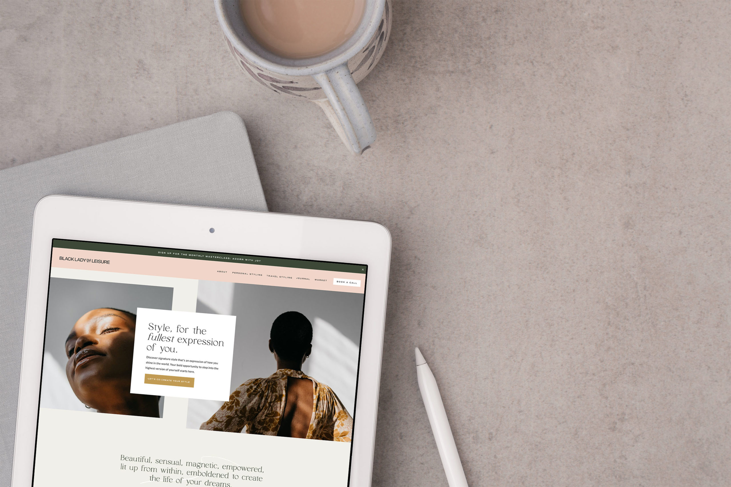
👉🏼 Here is an example of a Template Customization projects I had a chance to collaborate on with Black Lady of Leisure and Tonic, where we infuse a series of subtle movements onto her website to bring her fun, vibrant personality to life.
What do you think of website animations? Do you find them interesting or are they bothersome? I’d love to know below! ⤵️
BTW – If a website redesign has been on the back of your mind or on your ever-growing to-do list, I’d love to see how I can help! I take a strategy-led approach with my clients to curate a modern “digital home” that is not only pretty to look at but also strategic and high-converting. You are leaving money on the table if your website isn’t working FOR you, especially while you sleep! 😉 Book a call below to learn more!


FREE One-Page Showit Website Template
Take Showit For A Spin
Bringing your designer into your photoshoot ensures every image is intentionally aligned with your website, messaging, and designed to convert, not just look beautiful!

Why Work With A Website Designer When Planning A Brand Photoshoot
Finally, a design-forward AND user-friendly email marketing tool that makes sending emails fun again while bringing in actual conversions and results!

Why Flodesk Is The Best Email Marketing Platform For Small Business Owners
Read the post →
Readers' Favorites
read the post →


 connect with me on the gram!


© Vividly Made 2020-2026
")


